
This is the original A1 as sent to my tutor for feedback.
To see all research, exploration and development leading up to the final assignment one please see the separate Research, exploration and development page.
The reworked assignment as part of A6 can be found here.
Assignment One [Logic, Gates and Truth Tables]
Image 1 Rugby Triptych
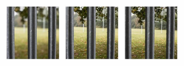
Our school is a rather sporty school, particular with rugby. However, not all students can access sports and even those who can, do so with varying degrees of success. Physical disabilities and issues with team games/social issues/noise sensitivity etc impact on many levels. In order to illustrate this I chose to capture the same view of the rugby posts, shot through the fencing to show the physical barriers, but using different apertures, using the changes in the depth of field to illustrate the varying levels of difficulty faced.
Image 2 Locked Gate
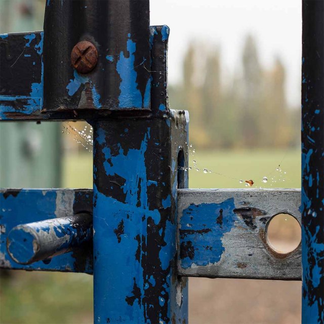
Along similar lines to the first image I chose to include this in the set as it is not just rugby students struggle with, so this picture sums up the general issues around accessing field sports.
If you wish to discover more about the issues ASD students have accessing sport take a quick look here.
Image 3 Press Buzzer
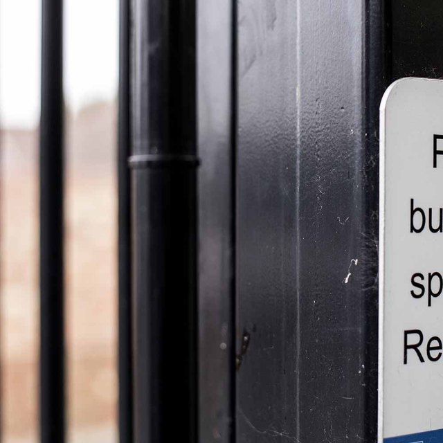
The Press Buzzer for Reception sign is cropped to reveal the problems some have asking for help or even seeing that help is available, all they see is the big black barrier in their way to the place they need to be.
For hints on helping students with Asperger’s ask for help take a look here.
Image 4 IT3 Dyslexia Diptych
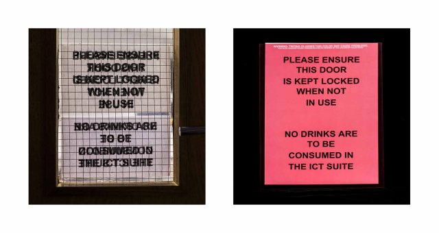
Dyslexia and Visual Stress are other very common problems experienced by many students, complaining that the letters move across the page or over lap each other. Occasionally this can be overcome by using coloured overlays and even obtaining tinted glasses.
See here for more information about coloured overlays, and this is a very interesting article with a simulator…
Image 5 Cushion and foot rest
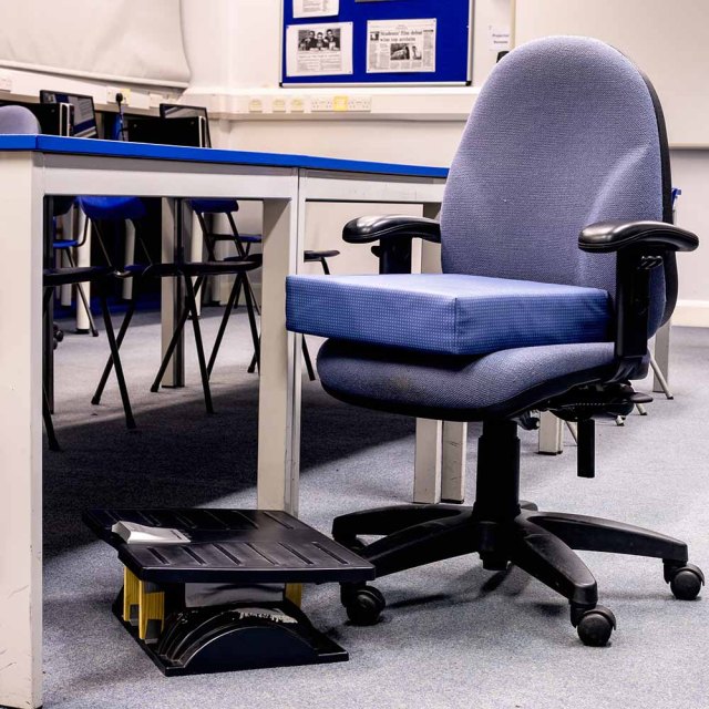
One of our students has significant health problems, which has resulted in impaired growth, he therefore requires these items to be able to sit comfortably and ergonomically at the school desks. He has a 1:1 learning support assistant who takes these from class to class whilst another student always very kindly offers to take his school books.
After a short spell in GOSH earlier this year the empty seat holds an extra poignancy for me that others looking may not experience.
Anyone wishing to support this brilliant hospital can do so here.
Image 6 Opening Doors
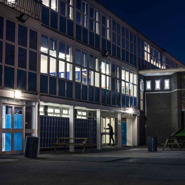
Another metaphorical image, using the darker foreground, brightly lit interior, with some of the blinds closed, to represent how in education we attempt to illuminate the way and open doors to success.
Pleased with the frames within frames, the geometric repeat patterns reveal little snippets of school life through the windows, the sixth form centre sign emphasises that students need support throughout their school career, and as I supervise directed study in there several times a week this is very pertinent to my role within the school.
Image 7 Extra Time Diptych
Several of our students have ‘special access arrangements and reasonable adjustments,’ and are allowed to use lap top computers for end of term assessments and exams. Most of these students are also allowed extra time and it is part of my responsibilities, as a learning support assistant, to ensure that the rules and regulations are adhered to during exam invigilation, as well as providing evidence throughout the year that this is the student’s ‘usual practice.’ Therefore I wanted to include some photographs that covered this aspect of their everyday school experience and my role within the department.
Access arrangements are strictly controlled by JCQ
Image 8 IEN Task Boxes
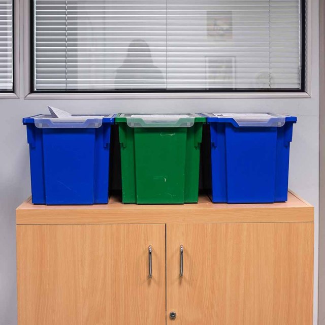
Something a lot of our IEN students struggle with is organisation, therefore we provide them with plastic boxes rather than lockers. They are then away from the general hubbub of the school when sorting their books and equipment, don’t have a locker key to lose and should they forget anything we can quickly run back to the office to collect it, whilst they remain in lessons. From an early stage students of all abilities get categorized and put into boxes and people don’t always see their individuality, especially with students with ASD who vary greatly, I don’t miss the irony that we literally put them into plastic boxes!
Other strategies for helping ASD students with organisation can be found here.
Image 9 Boxes Triptych
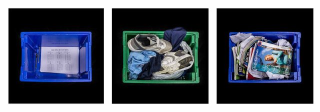
Taking the lids off of the IEN Task Boxes reveals three entirely different personalities… the black background isolates the subject matter revealing the segregation that students sometimes experience.
Image 10 – Ghost in the background
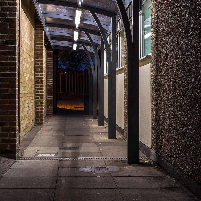
This covered walkway is between the IT rooms and the LRC ( Learning Resource Centre). Both buildings are integral to students’ learning and ability to access the national curriculum and I felt this summarised how I help the students bridge the gap when they struggle.
————————————————————————————————–
I have tried to be creative, as mentioned in my own personal aims, within the research and development page, but appreciate that creativity can always be pushed further and more risks can always be taken.
I have carried out thorough research with all the given exercises and even with my own quirky style of responses hope they demonstrate my developing intellectual understanding and self-awareness.
I am looking forward to receiving feedback, as positive or negative it is always useful to know if you are headed in the right direction and if not you need to be guided so that you are. It may mean I sit n sulk for a bit but will get over it! If you forced me I’d probably say that at this point I’m average on most things with the odd pop over into very good so C/B.
References
“The Photographic Brief” in Short,M. (2011) Creative photography context and narrative Lausanne:AVA Publishing, pp20-26
http://uk.businessinsider.com/quentin-tarantino-stolen-movie-scenes-2015-6
For ease of Assessment/Navigation other links for this Assignment are below
Tutor Feedback Page Tutor Feedback PDF Assignment One Rework
Response to tutor feedback
I had some initial feedback on tentative images for the set before final choices were selected and I submitted the final assignment idea for feedback.
The box idea works really well, the simplicity and identical (bar colour) of the container and the possibility of varying the contents is a strong visual metaphor. From a variation point of view; the gate(s) also, particularly the last image with the reception button. Also, I think the partly cropped images of text – although a more subtle approach – will work in the context of a set. The abstraction of chair legs,the signed letter have less impact for me, the former being too subtle perhaps, and the latter too obvious even though you make good use of field.
The idea of using a square format with oddly composed subject matter is a good idea for presentation especially the idea of the way society looks for uniformity.
While they all work as static images – still life in a sense – it might be worth exploring the idea of some peripheral activity/action to add an additional narrative dimension (as in the night shot) – I’m thinking of the fence triptych, chairs, gate.
In the feedback the main question raised by Russell was on the choice of presentation:
You explored some interesting methods of presentation, triptych, diptych, in addition to a single square format, all of which work, but perhaps, for better consistency, you might just choose one of those?
I explained in my response that I was attempting to show experimentation and exploration but agree that mixing so many ideas did’t make for visual coherency, so have decided to stick with single images.
Another good point was to consider the composition of one of my shots:
Cushion and foot rest’ also points out the postural problems some students may have and how special needs equipment can help, the separation between this chair and the others behind the desk creates a divide that many may not be conscious of. An angle from the end of the table emphasising this further would be an alternative composition – an ‘us and them’ point of view.
Unfortunately by the time I went to re-shoot this image the student concerned had already sat his final exam and taken his equipment home. I shall therefore reconsider its inclusion in the final set. I also had the added issue of changing my job and being unable to shoot some image to add in people for added dimension/action, although part of my idea was to show the issues rather than the students I can see the value of including something else to add to the narrative.
Taking on-board all of the advise /suggestions given I have decided to have single shots and swapped out some of the images selected. My final 10 are as follows:
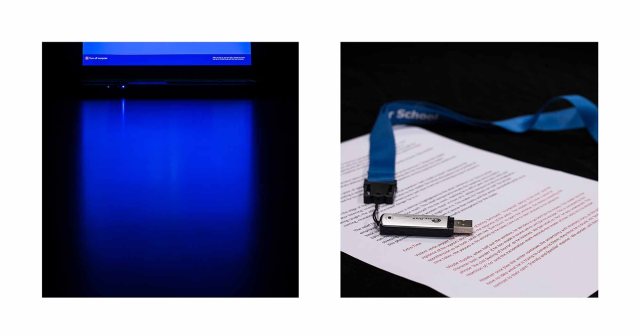
New – The new images were the cropped text and the open book. The open exercise book helped the continuing narrative of struggling to write down and express ideas and TA assistance provided.
The cropped text is a communication aid – posts and help signs on the wall to help students communicate, one is a numbered list that they can indicate at what point they are ok, or stressed. This image was deliberately cropped with negative space in the centre to underscore the difficulties they may have with their social skills and how we try to close that gap.
Removed – Although I feel that the removed lone chair image highlighted the physical problems experienced by some, I thought the composition could be improved, but was unable to re-shoot so it was removed.
I recognised that the ‘corridor’ image was not particularly strong so it was also removed.
The task boxes image was more or less a duplication of the individual images and did little to add to the narrative and was therefore removed.
Amended – To maintain a visual coherency the triptych and diptych images were reduced to single images with the stronger images remaining.
Evaluation
Visual style
I made a conscious effort to display the images as square crops in the style of Vivian Meyer and Paul Kenny. This linked to the idea of square peg round hole which can be a
Demonstration of Technical and Visual Skills:
Materials: As per the brief I kept to one lens and one focal length, 1.8 50 mm lens, which made me think of how images were composed and which elements to include. I used a tripod to allow me to take overhead and long exposure shots. Tutor feedback make me realise that although most of my shots were fine there were some that I could have improved. These I either re-shot or discarded.
Techniques: I used a variety of long exposure and overhead shots to capture the images I required. Due to not being able to show the students themselves was a challenge I overcame by using examples of their work or equipment used by them incorporating them into still-life images. Shallow depth of field helped show the elements which I wanted to include whilst obscuring the others.
Observational skills: I carefully selected my subjects dependent on different difficulties individual students encounter. This subheading also ties in with Visual awareness: I had to ensure that no students were visible in my photographs, shooting after school hours assisted with this, and I had to make sure that the subjects I wanted to include added to the narrative I wanted to tell. Some of the initial images were stronger than the others and tutor feedback made me look more closely at them and consider which ones should be removed or amended.
Design and compositional skills: My final images were captured to show the difficulties faced by SEN students and in some to reveal a little of their personality. After reflecting on tutor feedback I am happy that the final images provide a visual coherence and the composition of the signs and symbols contained in each image successfully puts across the intended message to the audience.
Quality of outcome:
Content: Although I am fairly pleased with the final set there are some I would like to have re-taken. For example the image of the student walking into the lit building at night. Being hyper-critical I feel his stance is a little too stiff and I would have preferred it to appear a little more natural. However as I no longer work in this educational establishment and the school where I currently work has very high security (people don’t randomly walk in or out) I was unable to redo this particular shot.
Application of knowledge: Research into the SEN plus my own personal experience, helped inform the direction of this assignment. Having a passion for the topic also was of great assistance. Initial research into semiotics and narratives was of great help in putting the final photographs together. Tutor feedback was also invaluable.
Presentation in a coherent manner: With the amendments carried out I strongly believe I’ve presented the final body of work in a coherent manner, all images can be described as still life, the consistent square crop works within the visual theme as well as metaphorically. The revised ordering helps the narrative flow, some images work well on their own whilst others do need to be seen as a set within the set to work, but this is not necessarily a bad thing, as long as the way in which the images should be viewed is conveyed.
Conceptualisation of thoughts and Communication of ideas: I posted my images within several forums and on social media and most people grasped the idea of difficulties to be overcome. This was even more obvious if people were affected on a personal level or worked within the field of education. Some observers needed a little more explanation which showed to me that either my images were not strong enough for the narrative, or they would benefit from captions given a mixed audience.
Demonstration of creativity:
Imagination: Given that this was my first assignment I didn’t want to be too imaginative and on the whole stuck to straight photography. I did deviate a little in that I did not include people at all, shots were taken both inside and out and were still-life, which can be unusual with a documentary narrative.
Experimentation and invention: I chose to experiment with an unusual square crop and with diptych/triptych. Grahram Clarke writes ‘the square format…suggests a voyeurism…as well as making the entire space of the photograph of equal significance.'(1997) Anything other than a single image proved to be a little too much therefore my final set was amended to reflect this. I experimented with a mixture of exterior landscape shots and deliberately composed interior images. I feel that the shallow depth of field and selective cropping works well within the images to convey the idea of only seeing half the picture and struggling to know what is always happening.
Context:
Reflection: completing this assignment made me more aware of how to think about the photographic brief, and the thought processes/ research involved when choosing a certain topic. It was my introduction to Short,M. (2011) Creative photography context and narrative Lausanne: AVA Publishing, which proved very useful throughout the entire documentary course. Seeking out peer review and acting upon tutor feedback helped me to refine my final set.
Research: I carried out extensive research into both artists and photographers who created bodies of work concerning those on the fringe of society, such as Alec Soth and Diane Arbus. Also those who used different cropping such as Vivian Meyer and Paul Kenny. I read the recommended reference materials, as well as undertaking my own research into photographers such as Taryn Simon, who photographed the ‘hidden’.
Critical thinking: semiotics played a major part in my decision-making again a nod to sections of Basics creative photography 02: Context and narrative as well as David Bate Photography: The Key Concepts, and Liz Wells Photography: A critical introduction.

Love this I can really hear your voice in this which makes it easy for me to read and follow, such a shame about the fire cooking idea, as I love you fire photos.
Well done my lovely, keep up the good work xx
LikeLike
I’ve got it now – just shows the difference between Facebook and a blog because images are much clearer on the latter and I realise how much detail I missed.
You’ve given much thought and detailed organisation to this assignment and your description of the contextual background adds so much more.
I’m sorry too about the loss of the fire project (oh the perils of being a photographer) but this Assignment has a lot of depth. I’ll be interested to read the feedback in due course.
LikeLike
Thanks for the responses you gave on fb and on here, I agree fb does compress the images a tad etc. I didn’t want to link to here straight away as I wanted people to view them without captions, titles or background info to get a gut reaction. It was also to kinda back up the earlier exercise we did when looking at the transparency of images, do we need text etc. I think with these images a little background information is needed to fully understand my visual ramblings as opposed to my written ones :o)
LikeLike
Pingback: Feedback to Jan Fairburn on her Facebook posting – Dave's Photography Foundations